Small duplex dedicated to reading near Parc Montsouris
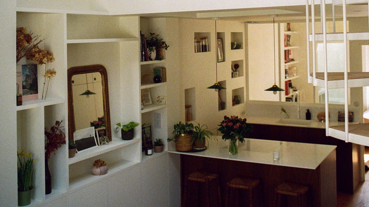
We are in the XIVe Paris district, near Parc Montsouris. It was in this building from 1900 on a quiet alley that Claudia* settled. Already converted into a duplex when he arrived, the apartment however lacked warmth and character. The Parisian agency Fréquence, made up of three female architects, intervened to bring the small style of that small space and bring in the light, badly distributed until then. 45 square meters below, 12 square meters above: the potential, very present, made it possible to release a beautiful surface of 70 square meters on the ground. “In this type of property, we prefer to think in terms of volume rather than surface”, specifies Lise Rougé Raoult, the architect of Fréquence who welcomes us. Indeed, every cubic centimeter is used here, with one main goal: to create the dream cocoon of Claudia, a great reader, to allow her to read in daylight and display all her books.
“It is neither a dining room nor a guest room, but a real reading room”, indicates Lise Rougé Raoult, indicating the space created. Separated from the living room by the kitchen, this new south-facing room enjoys natural light throughout the day; light from which Claudia benefits even more from her bench, installed on the edge of the window. “The most important thing for our client was to be able to read in daylight,” adds Lise Rougé Raoult. Adjacent, the kitchen benefits from the light of the reading room thanks to its transparent partition, as well as that of the glass blocks placed on the floor of the mezzanine, and the window on the north side of the living room. More than a kitchen, it plays the role of separator of the two very separate rooms; leaving the whole open to collect light from all sides. In the living room, the double-height wall of shelves was custom-made to accommodate Claudia’s books. “We imagined this shelf in a geometric spirit, with a play of proportions, so that we could have fun in the niches with the heights of the books and the objects. »
A second challenge for Fréquence: responding to Claudia’s architectural inspirations, sensitive to refined interiors with bohemian arrangements, such as the fink light and natural minorcan. White was therefore favored for the walls, to obtain the most neutral volume possible and to bring in as much natural light as possible. “We put white everywhere, including the kitchen taps”, specifies Lise Rougé Raoult. To soften this all-white, oak was added to the horizontal parts – parquet and stairs – and also walnut, whose color corresponds harmoniously to the exposed frame of the small duplex. Round shapes were also favored in this desire for gentleness; we find them in the glass paving stones of the mezzanine, on the spiral staircase, up to the switches and electrical sockets. Finally, a few touches of glass in the kitchen and in the upstairs bathroom bring in more light. “We try to be as refined as possible and get effects of light thanks to materiality”explains the architect.
Thus, the mezzanine was designed with glass blocks to bring light from the bottom to the top, without losing privacy with a slightly opaque glass floor. The choice of a spiral staircase (“sculptural object in drawn steel”) was also preferred so as not to lose any space or clarity. Above, Fréquence created “pirate evolution” using all the attic space – “including hidden doors that conceal deep storage”. Here again, light was favored thanks to the addition of new openings in the roof. The mezzanine accommodates a small office, subtly embedded in the fence “to be able to telecommute facing the glass roof, above the glass blocks overlooking the kitchen” and a bedroom. Designed as a mini suite, it reveals a dressing table with a large mirror to provide even more space (and sun rays), as well as a shower all in green zelliges. “Even in larger spaces, we always try to expand the space with games of mirrors and reflections”points out Lise Rougé Raoult.
The visit to this luminous bathroom, literally lit from floor to ceiling, ends with the bathroom on the ground floor covered with polished concrete; “a Spanish reference for its material and enveloping appearance, like velvet”. And it is by showing us a photo of Claudia, reading in the sun on her chaise longue, that the architect seems most proud of the work done. Challenge met.


